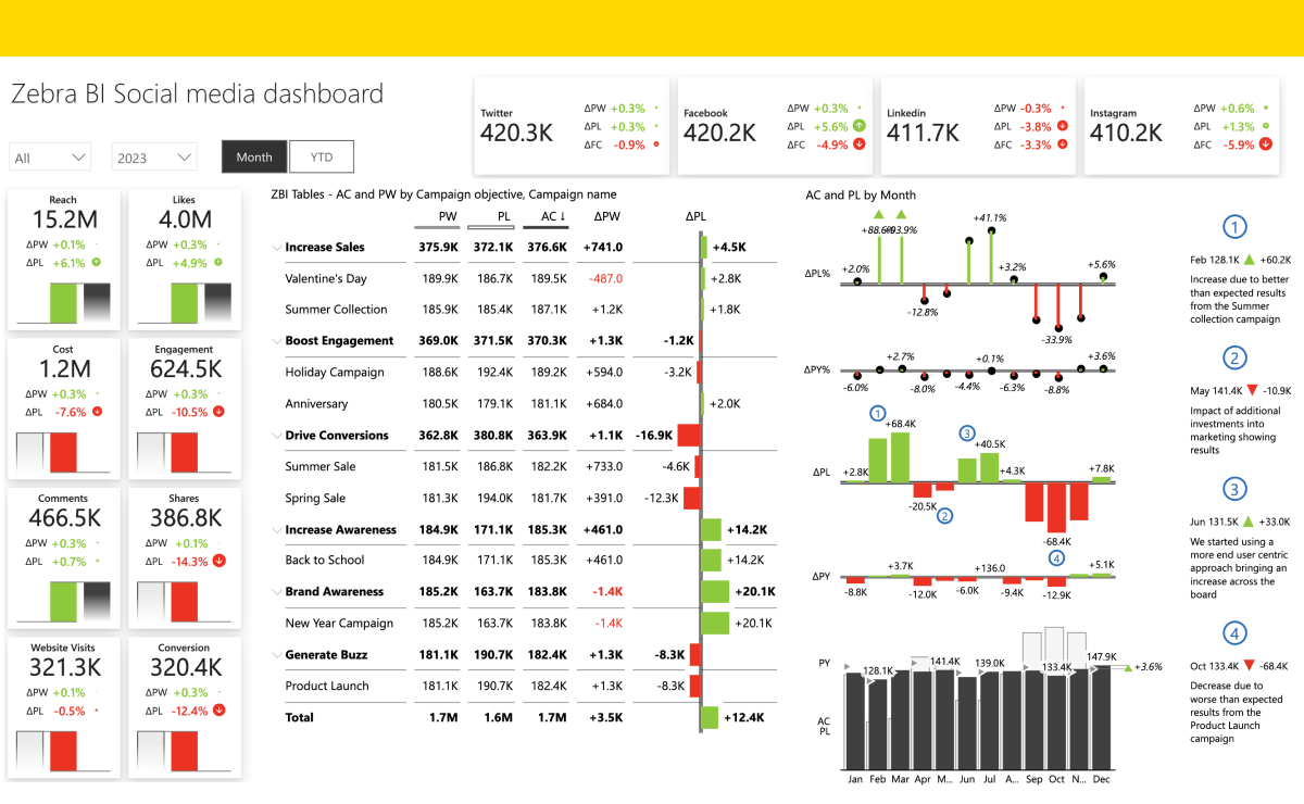
Stop Calling It a Dashboard: Tell the Story Instead

Every few weeks, I see the same thing happen again, and again. It’s not a new insight, but it keeps surfacing in our work: a smart analyst builds an impressive Power BI “dashboard,” presents it to leadership, and the room goes quiet. Eyes glaze. Someone squints. Eventually, the meeting ends with a polite “Thanks, we’ll review this later.”
The problem isn’t the data, or even the visuals.
It’s that we’re telling none of the story.
💡 Reports ≠ Dashboards (and Microsoft agrees)
Microsoft Power BI actually defines two distinct artifacts, reports and dashboards, though most organizations treat them as interchangeable.
Reports are multi-page explorations of data: filterable, drillable, full of nuance.
Dashboards are single-page canvases made up of tiles pinned from reports, a monitoring view, not a deep dive.
👉 Reports invite exploration; dashboards deliver signals.
But in practice, almost everyone calls both “dashboards.”
And that’s where clarity begins to unravel.
🎄 Even Good Dashboards Can Fail
Sven Balnojan’s piece, “Dashboards Suck—How to Make Them Suck Less”, nails a key point: most dashboards fail because they try to do everything.
“Your dashboard isn’t a Christmas tree.”
That one line says it all.
Every metric shouldn’t get equal airtime. Every chart shouldn’t fight for attention.
Balnojan’s cure is ruthless focus: start with one goal, and let everything else justify its existence, or get cut.
That same principle applies to reports and briefings.
Most of the time, our “dashboards” don’t fail because they’re ugly.
They fail because they’re overgrown.
📉 The KPI Paradox: Numbers Without Meaning
Here’s a quiet killer of comprehension: the KPI that stands alone.
A report tile might proudly announce:
Attrition Rate: 9.4 %
Great. But… compared to what?
Was it 12 % last quarter? Is the target 7 %? Should anyone be worried?
Without context, trendlines, benchmarks, tolerance bands, the number is just a number.
We assume leaders know whether it’s good or bad. Often, they don’t.
And when we throw fifteen such numbers on screen, we’re asking people to juggle more than the brain allows. Research shows that working memory can hold 3–5 meaningful insights at once before recall collapses. Beyond that, attention frays.

🧮 “Public Math” and the Missing Narrative
Another hidden barrier: we ask leaders to do math in public.
They’re handed data with no interpretation and expected to think aloud, in front of their peers, about what it means. It’s awkward. It’s cognitively demanding. And it shuts down discussion.
When data storytelling is absent, silence fills the gap.
A good data story prevents that.
It leads with the “so what,” walks through the reasoning, and shows only the visuals that clarify the point.
It lets leaders react to insight, not raw data.
✍️ From Dashboards to Data Stories
That’s the real shift: from presentation to narration.
A data story doesn’t replace reports or dashboards - it frames them. It’s the bridge between analysis and decision.
A strong one has three moves:
Frame the question. What are we trying to understand or decide?
Show key visuals. One or two, annotated with context and comparison.
Deliver the “so what.” What changed, why it matters, and what action follows.
Everything else, the full Power BI report, the dataset, the filters, belongs behind the link, not in the briefing.

🚀 Why This Matters
When you start with a story instead of a slide deck, three good things happen:
Leaders engage. They can follow the thread and remember what matters.
Analysts earn trust. Curating insights shows judgment, not just technical skill.
Organizations learn faster. Stories compound clarity; charts don’t.
Balnojan might say you’ve finally made your dashboard “not suck.”
I’d say you’ve stopped mistaking a dashboard for a decision.
🧭 The Bottom Line
We don’t need more dashboards.
We need better storytelling.
Dashboards and reports are ingredients.
The outcome is understanding - humans get there through narrative, not noise.
So before your next leadership briefing, pause and ask:
Am I showing data, or telling a story?
Because only one of those will be remembered once the meeting ends.


Couldn’t agree more
Plus 1000.